
 English
 العربية
The design of attractive prints is based on combining creativity with modern printing standards to obtain outstanding results. When we talk about printouts such as brochures, labels, labels, and packaging, it’s important that the design is attractive and reflects the brand identity professionally.
Test prints before final printing
Ensure that the design is compatible with digital or traditional prints
Balanced coordination and distribution in publications
Choosing the right paper type for prints
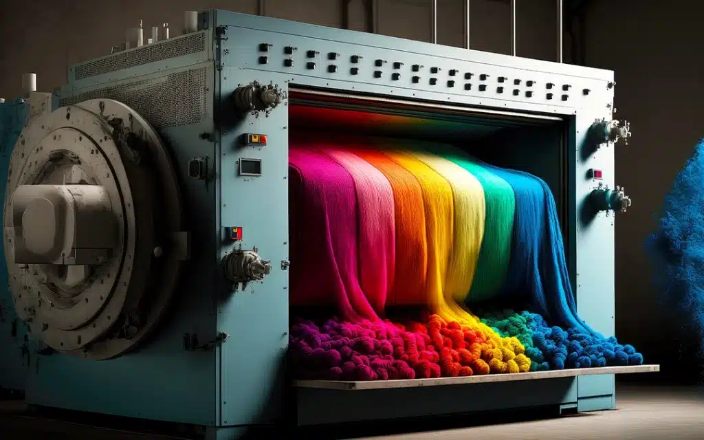
Use colors accurately in prints
Test prints before final printing
Testing prints before final printing is a crucial step in the design and printing process to ensure that prints will look their best. Prototype or “print” testing allows the designer or customer to concretely review all the elements before final production. This test is an important way to detect any potential design issues that may be unclear when working on screens, such as color contrast or text formatting.
One of the most notable benefits of prototype testing is to ensure color accuracy. The colors displayed on the screen may differ from those shown in print, so the test allows checking the conformity of colors to the actual print using the specified pattern. It can also contribute to adjusting the colors according to the desired result.
In addition, the print test allows you to check the quality of the paper and ensure that it fits the design. Choosing paper has a big impact on the final look of prints, as it can change the way colors and graphics appear. Therefore, testing prints helps ensure that the selected paper provides the desired effect.
Small details in the design, such as text margins or alignment, can be clearer when testing prints. You may notice minor errors that were not visible on your computer screen, such as uneven spacing between elements or incompatible dimensions. This test gives an opportunity to correct any problem with these details before the final printing begins.
Print testing also ensures that the design matches the actual print size. Some elements may have been inappropriately enlarged or reduced when transitioning from digital design to printing, affecting their clarity. By testing prints, the designer is able to ensure that everything turns out as expected.
Finally, prototype testing provides an opportunity to test the response of the customers or teams involved. Customers can provide feedback on design and content before printing in bulk, ensuring they are completely satisfied with the final result. Ultimately, this step contributes to reducing costly errors and improving the quality of final prints.

Ensure that the design is compatible with digital or traditional prints
Ensuring that the design is compatible with digital or traditional printing is an essential part of the print preparation process, as there are significant differences between the two printers in terms of the technical way they operate, which affects how the design appears in final prints.
In digital printing, modern technologies are used to print directly from computer to paper without the need for complex presets, making it more convenient to print in small quantities or when rapid changes are required. Therefore, it is important that the design is ready for digital printing by ensuring that the colors are set to the appropriate color models such as RGB (which is used in digital printing) to ensure that the image appears in vivid colors as in the monitor.
Traditional printing, which involves plate printing or graving, is more complex and requires careful settings before actual printing begins. In this case, the CMYK color model is used, which is based on azure, magenta, yellow, and black, which are the primary colors in traditional printing. When setting up the design for traditional printing, make sure that the colors match this model to avoid any difference in shades or gradients.
It is also necessary to take into account the resolution of images in both types of printing. Digital printing can handle images at 150-300 DPI, whereas in conventional printing, you may need higher resolution to ensure fine detail when printing at large volumes. This requires careful design to ensure that images are clear and do not contain any noise or loss of detail.
Print size should also be taken into account, as traditional printing may require design adjustments to be compatible with specific plate measurements, while digital printing is more flexible in handling changing sizes.
In addition, traditional printing requires special attention to the quality of paper and printed materials, as some types may not be compatible with traditional printers or may affect the final result, while digital printing can handle a wide range of materials.
Ultimately, ensuring that the design is compatible with digital or traditional printing requires careful consideration of the technical requirements of each type of printer. The designer must be aware of these nuances to ensure that the design will look perfect whether prints are printed using digital or traditional printing.
Balanced coordination and distribution in publications
Coordination and balanced distribution in publications is one of the most important aspects of design that directly affects the effectiveness of publications in delivering the message and facilitating the understanding of content. When designing any printed material, whether it is a booklet, identification card, or poster, the elements within the design must be organized harmoniously, so that the reader navigates between these elements smoothly and without distortion.
First, balanced coordination means distributing items appropriately within the available space so that there is no area cluttered with objects and completely empty ones. Distribute text and images should be even so that it is easier for the reader to identify important parts of the design. This includes placing headings prominently with clear breaks between paragraphs and text.
With good formatting, the reader is able to navigate between information easily, which helps speed up message assimilation. For example, placing headlines in an instantly visible place, such as the top of the page, or using larger fonts to highlight the most important points, makes prints more effective.
Balanced distribution also includes the thoughtful use of blank spaces (known as “white air”) that help improve reading and avoid flooding the reader with overcrowded content. These spaces make prints more visually comfortable and enhance the reader’s focus on key content.
Balanced coordination also enhances the flow of the eye through the design, as the reader can start from a specific place in the design and move seamlessly through the elements. For example, text and images can be arranged so that the reader follows a logical path, from the title to the key details, and then to the conclusion.
Attention should also be paid to visual sequences within prints using techniques such as gradation or geometric shapes to direct the eye towards the most important element. These techniques can be a powerful tool for increasing visual message clarity.
Balance in color distribution also has a big impact; choosing consistent colors and making sure not to use conflicting colors helps create an attractive and consistent look, enhancing the reading experience.
Ultimately, balanced coordination and distribution is the basis for achieving a reader-friendly and engaging print design, ensuring that the information is effectively absorbed and that the message to be communicated reaches the target audience clearly and professionally.

Choosing the right paper type for prints
Choosing the right type of paper for prints is a crucial step in the design process, as it greatly affects the quality of final prints and the overall appearance. Paper is not just a means of printing a design, it is an essential element that can enhance or reduce the visual design effect. Therefore, the type of paper should be chosen based on the type and purpose of the design, because each paper type has characteristics that affect the final appearance of the prints.
First, glossy paper is commonly used for prints that require bright and sharp colors, such as promotional brochures and advertising posters. Glossy paper reflects light and makes colors brighter and clearer, giving a powerful visual effect. However, it may be less durable than matte paper in some cases, as it can easily show fingerprints.
Matte paper gives a sleek, more professional look, and is often used in prints that require a calm and balanced look such as corporate brochures or business reports. This type of paper does not reflect light as glossy paper does, making text and images appear more clearly readable without distraction.
Recycled paper has become a popular choice in many eco-friendly and sustainable designs. Recycled paper offers a different look than traditional paper, as it can have some creases or a coarse texture that gives a unique character. It is an ideal choice for publications that want to highlight environmental awareness or companies that focus on sustainability.
It is also important to determine the thickness of the paper based on the type of prints. Thick paper gives a sense of luxury and quality, and is the ideal choice for prints that are given as a gift or those that require a strong impression, such as business cards or wedding invitations. Thin paper is ideal for prints that need to be lightweight and easy to distribute, such as brochures or flyers.
The resistance of the paper to different environmental conditions must also be considered. For example, in the case of prints that will be used outdoors or in high-humidity environments, such as window posters or billboards, it is preferable to choose waterproof or wear-resistant paper.
Finally, choosing the right type of paper has a significant impact on printing costs, as high-quality paper can increase the cost of the project. Therefore, the choice of optimal paper and its quality must be balanced against the budget allocated for printing.
In short, the choice of paper in the design of prints must be carefully considered, as it integrates with the design and purpose to ensure a professional appearance and high quality that suits the customer’s requirements and supports the visual message of the prints.
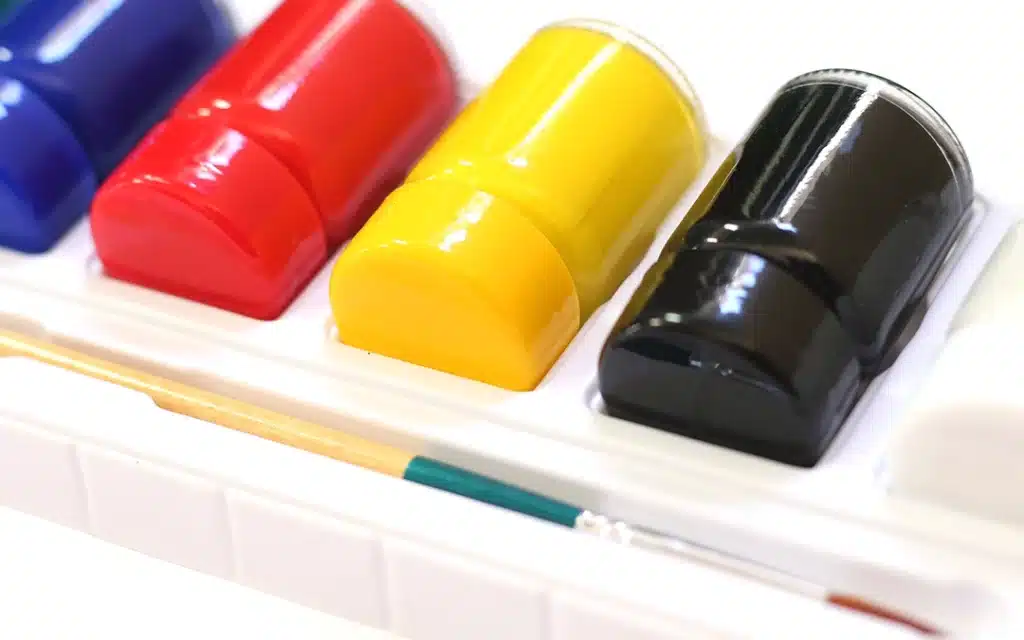
Use colors accurately in prints
The accurate use of color in prints is one of the main aspects that greatly affects the quality and nature of final prints. Colors are not just aesthetic elements in design, but rather expressive tools that play an important role in delivering the message to be delivered to the viewer or reader. Hence, the designer must apply color theory appropriately and adjust it according to modern printing standards to ensure color accuracy and quality.
First, the CMYK color model (which consists of four colors: sky blue, purple, yellow, and black) is the preferred printing model, as it relies on mixing these colors to obtain accurate colors when printing. In digital or traditional printing, this model is used to fine-tune and apply colors to paper. The designer must make sure that the colors he uses match this model to ensure that they look correct when printing.
Conversely, in digital design, the RGB (Red, Green, Blue) color model is often used, which relies on light to produce colors. When switching between digital printing and on-screen design, color differences may occur because printers rely on mixing pigments, not light. Therefore, it is important for the designer to check the color contrast in both models and adjust them before printing.
Also, color gradations are important to consider in designing prints. When using gradient in design, make sure that the printer is able to accurately reproduce these gradients, without showing streaks or noise. Some printers may be more able to print gradient smoothly, while others may need additional adjustment.
Color contrast is another factor that affects the clarity of prints, especially when working with text and images. There should be proper contrast between texts and backgrounds to ensure easy reading. Dark colors on light backgrounds or vice versa are best for clarity, while using similar colors may make text blurred or difficult to read.
It is also necessary to test colors on print samples before final printing in bulk. On-screen printing does not always reflect the final result, so an initial test should be performed on the selected paper to verify the accuracy of the colors and their compatibility with the desired design.
Choosing the right colors based on the purpose of the prints is also crucial. Colors have a psychological effect, such as blue, which suggests confidence and calm, and red, which expresses energy and impulsiveness. The colors used must be consistent with the brand identity and aim to stimulate the desired response from the audience.
Finally, there must be harmony between the colors. Even if the colors are accurate, the balance of colors can make a big difference in the visual impact of prints. Choosing colors that complement each other and enhance each other’s color contributes to attracting attention without there being confusion or distraction.
In short, the exact use of color in prints requires a combination of technical knowledge and creative design. Applying the correct color standards ensures that prints will look their best, while maintaining color accuracy and delivering an outstanding visual experience.
No comment