
 English
 العربية
Marketing advertising is a key tool to attract customers and increase brand awareness. To create engaging ads, the message must be clear and direct, and the design must be in line with the brand’s visual identity. This includes the use of appropriate colors, fonts, logo, and visual elements that represent the brand’s personality.
- Compatibility with visual identity in marketing ads
- Use colors strategically in marketing advertising
- Innovation and innovation in marketing advertising
- Consistency between advertising and different channels in marketing ads
- Understand the purpose of marketing advertising
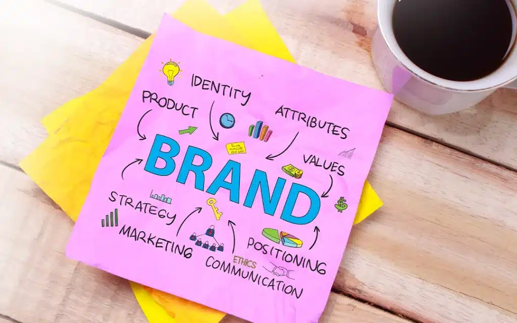
Compatibility with visual identity in marketing ads
It is critical to ensure that the advertising message is aligned with the brand image and enhances its credibility in the eyes of the public. Marketing ads should always be compatible with the core elements of visual identity, such as colors, fonts, logo, and the overall design style defined for the brand.
When ad design aligns with the brand’s visual identity, it’s easy for customers to recognize and interact with the brand, whether they’re watching the ad on social media or in traditional media. This consistency promotes excellence and makes the marketing message clearer and more professional.
For example, if a brand uses blue and green as part of its visual identity, those colors should be prominent in all marketing ads, whether digital or print campaigns. Using the same fonts or design patterns also helps strengthen the connection between the audience and the brand.
Also, visual identity alignment contributes to creating a consistent experience across all channels, enhancing the customer impression and increasing the effectiveness of the marketing campaign. If visuals are inconsistent, this can lead to distraction and loss of ad effect.
Overall, matching with visual identity in marketing advertising is a key element to building a strong and sustainable brand image, making the audience more connected to it and contributing to the success of the advertising campaign.
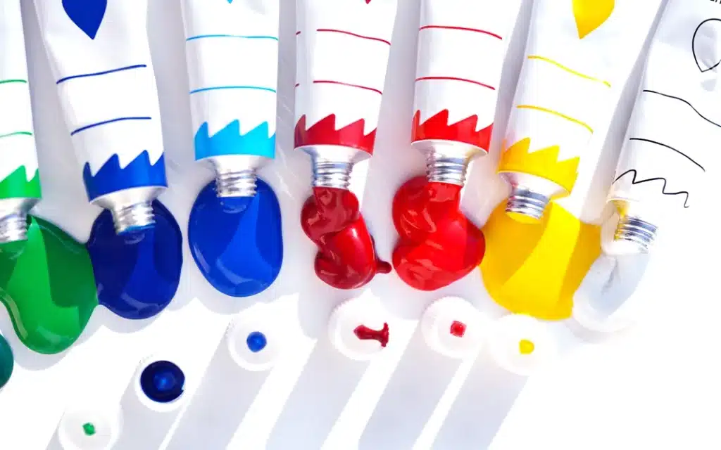
Use colors strategically in marketing advertising
It is one of the most important factors that contribute to attracting attention and stimulating interaction with the audience. Colors have a strong psychological impact on individuals, and can trigger certain emotions that affect their purchasing decisions or even how they perceive the brand. Therefore, designers must use colors very carefully to achieve marketing goals.
First, blue expresses trust and professionalism, which is why it is commonly used in brands related to financial or technological services. Red stimulates energy and excitement, making it ideal for ads aimed at motivating customers to take quick steps, such as promotions or downloads.
Second, green is associated with comfort and nature, and is often used in advertisements highlighting ecological or health products. While yellow represents optimism and positivity, it can be used to draw attention to special shows or special events.
Using colors strategically also requires understanding the interaction of colors with each other. For example, coordinating between dark and light colors can enhance the visibility of text and increase the impact of the ad. Contrasting colors make the message clearer and more attention-grabbing, especially when it comes to items like titles or calls to action (CTA).
On the other hand, the culture of the target audience must be taken into account, as colors may carry different meanings in different cultures. For example, white is considered a symbol of purity in some cultures, while in others it can be associated with sadness. So, designers should pay attention to these nuances to avoid misunderstandings.
Finally, the use of colors must be compatible with the visual identity of the brand. Colors should reflect the core values and principles of the brand to provide an integrated and distinct experience for the audience.

Innovation and innovation in marketing advertising
They are essential elements to attract public attention and stand out in a crowded market. In the world of digital and traditional marketing, innovation in advertising design is what distinguishes successful campaigns from others. Through the use of new ideas, innovative techniques, and an unconventional approach, marketing ads can stand out and catch the attention of the target audience.
Creating marketing ads requires thinking outside the box, whether it’s through the use of unique images, attractive text, or even interactive video technology. Also, innovation in style and design can contribute to creating an interactive experience that captures customers’ interest and makes them remember the marketing message for longer.
Moreover, innovation not only means the use of new designs, but can also include the use of new platforms and means to reach the public, such as the use of augmented reality (AR) or innovative filters on social media. Adopting innovative approaches in marketing advertising helps build a stronger relationship with the audience and increases the chances of engagement and conversion.
In the end, innovation and innovation in marketing advertising are what ensure the excellence and success of campaigns, because the audience is always looking for something new and exciting that catches their attention and enhances their experience with the brand.

Consistency between advertising and different channels in marketing ads
Colors have a strong psychological impact on individuals, and can trigger certain emotions that affect their purchasing decisions or even how they perceive the brand. Therefore, designers must use colors very carefully to achieve marketing goals.
First, blue expresses trust and professionalism, which is why it is commonly used in brands related to financial or technological services. Red stimulates energy and excitement, making it ideal for ads aimed at motivating customers to take quick steps, such as promotions or downloads.
Second, green is associated with comfort and nature, and is often used in advertisements highlighting ecological or health products. While yellow represents optimism and positivity, it can be used to draw attention to special shows or special events.
Using colors strategically also requires understanding the interaction of colors with each other. For example, coordinating between dark and light colors can enhance the visibility of text and increase the impact of the ad. Contrasting colors make the message clearer and more attention-grabbing, especially when it comes to items like titles or calls to action (CTA).
On the other hand, the culture of the target audience must be taken into account, as colors may carry different meanings in different cultures. For example, white is considered a symbol of purity in some cultures, while in others it can be associated with sadness. So, designers should pay attention to these nuances to avoid misunderstandings.
Finally, the use of colors must be compatible with the visual identity of the brand. Colors should reflect the core values and principles of the brand to provide an integrated and distinct experience for the audience.

Understand the purpose of marketing advertising
Marketing ads should always be compatible with the core elements of visual identity, such as colors, fonts, logo, and the overall design style defined for the brand.
When ad design aligns with the brand’s visual identity, it’s easy for customers to recognize and interact with the brand, whether they’re watching the ad on social media or in traditional media. This consistency promotes excellence and makes the marketing message clearer and more professional.
For example, if a brand uses blue and green as part of its visual identity, those colors should be prominent in all marketing ads, whether digital or print campaigns. Using the same fonts or design patterns also helps strengthen the connection between the audience and the brand.
Also, visual identity alignment contributes to creating a consistent experience across all channels, enhancing the customer impression and increasing the effectiveness of the marketing campaign. If visuals are inconsistent, this can lead to distraction and loss of ad effect.
Overall, matching with visual identity in marketing advertising is a key element to building a strong and sustainable brand image, making the audience more connected to it and contributing to the success of the advertising campaign.
No comment