
 English
 العربية
Logo design and visual identities is an essential part of any organization’s identity, reflecting the essence of the brand and enhancing its connection to the audience. Building a distinctive visual identity requires a deep understanding of the organization and its goals, as well as creativity and innovation. Here’s a simplified explanation of how to build a distinct visual identity for your organization:
Design and understanding of the organization and its mission
Design and choose the right colors
Logo Design
Font selection design (Typography)
Design the creation of complementary visual elements
Design and organize identity across all media

Design and understanding of the organization and its mission
The first step in logo design and visual identity is to understand the vision and mission of the company. This step is the basis on which everything related to the visual identity of the organization is built, as it contributes to determining the general direction of the design and directing it in line with the company’s objectives.
The vision represents the future image of the organization, and the mission is the goal or goal that the company seeks to achieve. When designing a logo, these two elements should reflect the essence of the company and the nature of its work in a clear and simple way. For example, if a company is in the field of technology, the logo should express innovation and accuracy. If the company operates in the field of nature or the environment, the logo may include natural elements that reflect the company’s commitment to environmental values.
In addition, the choice of colors is one of the most important elements of design, as colors play a large role in non-verbal communication with the audience. Each color has its own psychological and moral connotations. For example, blue suggests confidence and credibility, green is associated with health and growth, and red expresses vitality and energy.
Typography is an essential part of visual identity design. Fonts should be carefully selected to be compatible with the nature of the company, so that they are easy to read and reflect the style of the organization. Straight lines may reflect seriousness and professionalism, while curved lines may give a more friendly and flexible impression.
When designing a logo, the visual element should be simple but powerful, so that it is easy to remember and remains in the mind of the audience. It should also be usable in various media such as print, websites, and advertising, which enhances the company’s presence in the market.
Overall, designing a distinctive logo and visual identity requires a deep understanding of the organization and the nature of its work. The choice of colors and fonts must be compatible with the company’s values, to reflect its identity in a way that distinguishes it from the rest of the companies in the market.

Design and choose the right colors
Colors play an essential role in building the visual identity of any brand, as they contribute to communicating with the audience on an emotional, non-verbal level. Colors greatly affect how individuals respond to visual content and help form initial impressions of a brand. Choosing colors carefully can enhance brand impact and make them more unique and relevant to the target audience.
For example, blue is one of the colors that is associated with confidence and professionalism. It is commonly used in companies that want to project a strong reputation and high credibility, such as technology and finance companies. Blue reflects a sense of security and encourages calm and focus, making it an ideal choice for brands seeking to build a relationship of trust with their customers.
On the other hand, red is one of the colors that express energy, enthusiasm, and passion. Red is distinguished by its strong attractiveness and ability to quickly attract attention. It can symbolize excitement and motivation, and has a motivational effect on the audience. Therefore, it is widely used in brands that seek to communicate feelings of power, enthusiasm, or even speed, such as sports or entertainment brands.
When choosing colors, it is essential that they align with the essence of the brand and the nature of its work. Colors are not just aesthetic details, they are a powerful means of conveying the organization’s message. For example, if the brand specializes in health or environmental products, it may be better to use green or brown colors that suggest nature and growth. While if the brand focuses on luxury and luxury, colors such as gold and black may be more suitable.
It is also important that the colors match the target audience. The colors preferred by a particular audience may vary depending on culture, age, or even geographic region. Therefore, these factors must be taken into account to ensure that colors summarize the core values of the brand and fit the target audience, thus enhancing the success of the visual identity in the market.
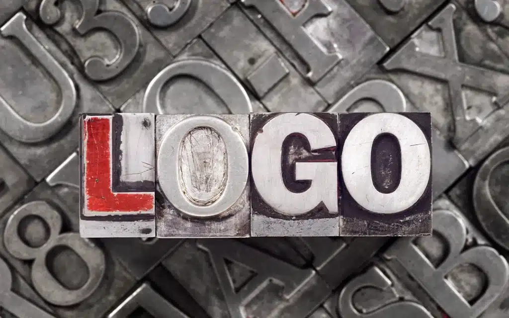
Logo Design
The logo is the core element of any organization’s visual identity, as it represents the first interface through which the audience sees and recognizes the brand. A logo is a face that reflects the organization’s personality and values, and its design should be simple but strong enough to leave a long-lasting impression on the audience.
The simplicity of the logo is one of the most important factors that make it easy to remember. When a logo is simple, it becomes more recognizable, even in circumstances where the audience is limited attention or in crowded environments. Simple shapes also facilitate the process of reproducing the logo in multiple mediums such as prints, digital advertising, or even on products.
The logo should accurately reflect the character of the enterprise. If a company is to excel in creativity and innovative thinking, this must be reflected in the logo design. If it seeks to deliver serious and reliable value, the logo must reflect these values using serious and professional design elements. For example, clear geometric shapes such as circles or squares that carry the meanings of stability and consistency can be used.
It is also important that the logo is usable in all advertising media. The logo must be flexible enough to look good whether it’s on a small business card or a large banner on a storefront. It should remain clear when enlarged or minimized, and work well when used in color or black and white. Hence the importance of designing the logo in a way that ensures its compatibility with all media such as prints, websites, and social media.
It is always preferable to use an innovative and funky design. Innovation helps differentiate the logo from competitors and makes it more eye-catching. The use of symbols or icons that are closely related to the company’s activity enhances the logo’s ability to communicate the desired message quickly and clearly.
Ultimately, the logo should be an effective communication tool, leaving an immediate impression on the public about the organization’s identity. With its simple, flexible and innovative design, the logo becomes an integral part of brand strategies and contributes to building a sustainable relationship with customers.
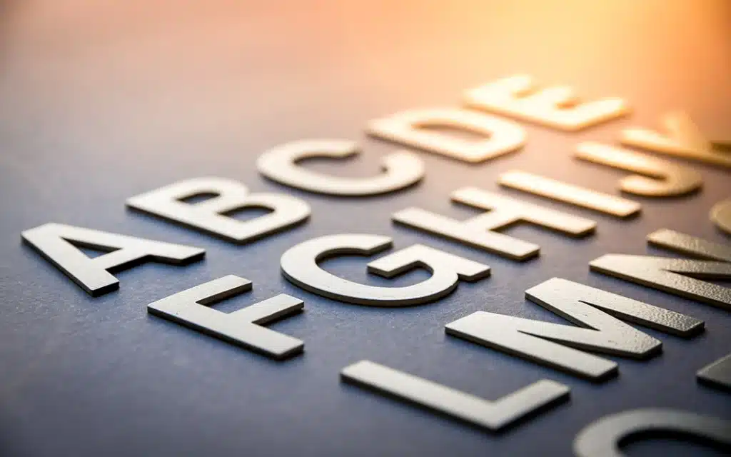
Font selection design (Typography)
Calligraphy plays a vital role in designing the visual identity of any organization, as it is not just a means of displaying text, but rather a part of visual communication that reflects the brand’s personality. It is essential that the fonts are clear and easy to read to ensure that the text messages carried by the visual identity reach the audience clearly and quickly. Using blurred or complex fonts may hinder understanding of the message and reduce the impact of the design.
When choosing fonts, they must align with the style and identity of the organization. Each line reflects a certain feeling and contributes to building the first impression of the brand. For example, straight and clear lines such as San Cerif reflect professionalism and seriousness, while curved lines such as Cerev may give a sense of tradition and luxury. Therefore, it is important to choose fonts that suit the personality of the organization and the nature of its work.
A main font is usually chosen to be used in the logo, where this font is the distinctive element that represents the identity of the company. The main font should be simple, unique, and easy to read, as it will be repeated in all promotional materials and advertisements. This font may be customized or borrowed from popular fonts provided that it accurately reflects the brand’s personality.
In addition to the main font, you should choose another font for textual content in marketing materials. This font should be complementary to the main font and is used in detailed texts such as advertisements, websites, and brochures. It is important that the second font is consistent with the first font but distinguished from it so that it is easier to distinguish headings and body texts from the rest of the content.
Consistency between fonts enhances visual identity and provides a comfortable reading experience for the audience. If the fonts are conflicting or inconsistent, it can confuse the reader and break up the desired impression. Therefore, it is essential to test fonts in different contexts and media to ensure that they are clear and easy to read across all devices and printed materials.
Also, the fonts should be flexible, so that they work well in all sizes and dimensions. When the logo or text content in ads or microcards is minimized, the font should remain clear and readable. This ensures that the logo and text elements are always clear, regardless of the medium used.
Ultimately, fonts not only enhance the clarity of the texts, but also contribute to the visibility of the brand and enhance its visual impact.

Design the creation of complementary visual elements
Icons and visual patterns are important elements that contribute to the enhancement and integration of the visual identity of the brand. Although the logo is the main element that defines an organization’s identity, icons and visual patterns add additional value and extend the identity to all promotional and digital materials. These elements contribute to the brand’s distinctiveness and help the audience to identify it easily, enhancing the clarity of its message.
Icons are small images that represent specific ideas or concepts and help communicate the brand’s message quickly. Icons can be part of the logo or used separately in promotional materials such as apps, websites, or even in advertising campaigns. For example, if a brand is in technology, icons might include elements such as devices or circuits that support the brand’s image and show its specialization.
Visual patterns include distinctive shapes and colors that are frequently used in visual identity. Such as geometric patterns or repetitive drawings that help create a uniform look across all promotional materials. These styles give marketing materials coherence and coordination, making the audience feel that all materials are linked to the same identity.
The use of icons and visual patterns also contributes to making the brand more flexible in dealing with multiple platforms. Whether these elements are used on social media, websites, or print materials, the visual identity remains consistent, making it easier to recognize the brand in any context. For example, icons can serve as a visual shortcut to the values or products offered by a company.
By incorporating icons and visual patterns into the identity, a brand becomes better able to communicate with its audience in an effective way, and makes it stand out in the competitive market. These elements also help build an emotional connection with the audience, as they can evoke certain emotions or positive reminders every time they are seen.
Moreover, icons and visual patterns are powerful tools for building an integrated identity on a global level. When used correctly, these elements contribute to the brand’s distinctiveness and make it more memorable in the long run.
Design and organize identity across all media
Visual identity is the appearance that reflects the brand’s personality, and it must be consistent across all points of contact with customers to ensure that the visual message is delivered uniformly. These points include the website, social media, brochures, product packaging, and other media that interact with the public. The careful coordination of all these elements enhances the visual identity effect and makes it more powerful and clear in the customer’s mind.
When the visual identity is consistent, customers become more attached to the brand, and feel trusted and professional. For example, if the logo colors and fonts used on the website are in line with those that appear in promotional materials or product packaging, this creates an integrated visual experience and enhances brand distinction.
Formatting in visual identity requires that colors, fonts, icons, and patterns be consistent in all marketing materials, whether physical or digital. For example, the logo should appear the same shape and color on different platforms, whether it’s on Facebook, on the website, or in Instagram posts. Asymmetry in these elements may lead to customer confusion and may reduce brand credibility.
Also, good coordination helps achieve a strong visual effect that can distinguish the brand in crowded markets. When a customer encounters the same consistent visuals every time they interact with the brand, a strong impression is made in their mind, which enhances brand awareness and makes it easier to remember.
The harmonious visual identity reflects high professionalism, which contributes to building customer trust. For example, when designing the packaging of a new product or logo, these elements must be consistent with the company’s existing visual identity, including colors, fonts, and styles. This reflects the company’s attention to detail, and gives the impression that it cares about providing an integrated and high-quality customer experience.
Also, when coordinating identity across all media, it is important to consider the technical differences between different media. For example, in social media elements may need to be simpler or more suitable for small screens, while on prints you may need subtle and clear details.
In the end, careful coordination of all visual elements makes the identity more distinctive, and contributes to building a strong and long-term relationship between the brand and customers.

No comment